
“You can’t use Grapher to plot data.” Not true! You can use Grapher to plot data – it’s just a pain in the butt. Nevertheless Grapher can be useful if you want to plot a small data set and/or do some quick and dirty curve fitting. As always, click on any image to enlarge.
I. Creating a New Point Set
In Grapher, data is stored as a “point set”. Go to the main menu, and click Equation → New Point Set. Grapher creates a new point set containing four sample data points (it’s always the same four points), and lists it in the equation list as “Untitled Point Set” (here I’ve renamed it “Simple Point Set”): 
As with all things Grapher, you can modify the appearance of your data using the Inspector: 
“Line” controls the color, thickness, and style of the lines connecting the points. “Arrow” supposedly allows you to select arrow styles, but I have yet to see it have any effect on the plot. “Fill” sets the color for the data points themselves. For example, you could have hot pink data points connected by green lines: 
“Polygon” determines whether your points are connected by lines or not (yes if checked). There are two options: “Broken Lines” connects your data points with straight line segments; “Bezier Curves” connects your data points with funky-looking curves. Finally, “Marks” selects the shape used to represent data points: circle, cross, square, or diamond. The size of the data points are adjustable with the Size slider.
II. Editing Points
While staring at the same four data points and experimenting with garish color combinations is amusing, we would like to plot our own data. To do this click the “Edit Points” Button at the top of the graph. This drops down a screen containing two tabs: “Points”, and “Coordinates”.
A. Points tab
The Points tab presents a spreadsheet-like window that allows you to manually enter data points.  Each row in the spreadsheet constitutes a single data point. If you wish to change a particular coordinate, simply double-click on that number and edit it. You can add or delete rows and columns with the self-explanatory Add and Delete buttons located above the spreadsheet. You can change the position of any particular point by clicking on its row and dragging it to the appropriate location. You can also select multiple rows using the usual shift-click, or select the entire table using Command-a. Unfortunately, Grapher does not appear to accept non-number entries: you cannot use Numbers or Excel-like cell references or formulas.
Here I’ve added two more points to the sample set, and the plot has changed accordingly: 
B. Coordinates tab
The sample data set includes three columns for each point: one for x, one for y, and one just to confuse people. The role of each column is determined in the “Coordinates” tab. Here you can define the coordinate system (Cartesian or Polar), and assign x and y (or r and θ for polar coordinates) to particular columns. The default is Cartesian coordinates, with column 1 = x, and column 2 = y.
For example, if I take the sample data set, change it to polar coordinates, define column 3 = r and column 1 = θ, I will get this plot: 
C. Multiple data sets
Unfortunately, Grapher will only allow you to define one (x,y) pair per point set; you cannot plot both y columns from the sample set at the same time. One workaround is to make a copy of the entire point set (via Command-a, Command-c), create a new point set (via Equation → New Point Set), go to Edit Points in the new set, delete the sample points, and paste your data into the spreadsheet. You can now set your original point set to display column 1 = x and column 2 = y, and the copy to display column 1 = x and column 3 = y: 
III. Exporting Points
If you’ve entered your points manually, you may wish to export them for use in other programs. Click the “Export” button under the Points tab. Grapher will ask you to choose the file name and save location, as well as what to use for column and row separators. Note that Grapher will always save the data as a .txt file.
This file was exported using “Tabulator” (tabs) as column separators and “Return” as row separators: 
IV. Importing Points
You can also import data from other programs into Grapher. Create a new point set, go to the Edit Points window, delete the troublesome sample points, and click the Import button. Grapher asks you what file you want to import, and what characters to use as column/row separators. One caveat: Grapher wants a .txt file. It will not accept .numbers, .xls, or even .csv files. Therefore, if your data is in, say, a Numbers spreadsheet, you must first export the data from Numbers into a .csv file, open the .csv file in TextEdit, then save it as a .txt file. Hence my expression “pain in the butt”.
Grapher Quirk: although the import menu has an option to skip the first “n” lines of the file, I have yet to get this option to work. Whenever I try to import a text file with header rows, Grapher just sits there and refuses to import anything. So be prepared to delete any header rows in your import file.
Here I’ve imported a series of 50 points from a Numbers spreadsheet → .csv file → .txt file. X coordinates were generated using a random number generator over the interval [-5,5]. Y coordinates were generated using the formula y=x+1, plus random noise evenly distributed over a ± 0.5 interval. The resulting plot: 
Looks terrible, but no need to panic. Since I artificially generated the data using a random number generator, my points were not in any particular order. We can fix that. Go to the Edit Points table, select column 1 (x), and press Sort → Ascending. Voilà:  N.B. – if desired, you could uncheck the Polygon box in the Inspector to remove the lines between points.
V. Interpolation
Statistics Disclaimer: I suck at statistics. I have no experience with SAS or any of the other big statistics packages, and can barely comprehend the Student’s t-test. So if there are any errors or omissions in the subsequent discussion, please feel free to contribute.
What Grapher calls “interpolation”, I would call regression or curve fitting. Clicking the Interpolation button located above your graph brings up the following window: 
A. Types of Regression
Grapher allows you to fit several different types of curves to your data:
- linear, or “affine” (
)
- polynomial (
)
- exponential (
)
- custom
Selecting the Custom option brings up a little window in which to enter your desired equation. Two parameters are the default; you can define additional parameters with the little “+” in the top right corner of the parameter box.
Grapher quirk: The Custom regression equation window is buggy – your best bet is to create the equation in the usual Grapher equation window, and copy it into this one. The Custom regression itself is somewhat hit or miss. Linear combinations of the preset regressions (e. g. polynomial + exponential) usually work, as do simple functions such as sine waves. However, a power law equation (
Here’s a picture of my data set after linear regression: 
B. Initial parameter values
Both exponential and custom regressions require initial guesses for parameter values. Since I don’t know how Grapher determines these regression coefficients, I cannot say what constitutes a “good” initial guess. If Grapher doesn’t like your initial value, it will return the error “Interpolation Singularity”, and tell you to try again with different initial values.
C. Stroke
If you like the curve that Grapher came up with, you can save it for posterity by pressing the (vaguely obscene-sounding) “Stroke” button. This saves the regression as a separate equation in your Equation List:
If you do not save your regression curve via Stroke, it will vanish when you close the interpolation window.
D. Quality control
Please refer to the Statistics Disclaimer above. The following discussion represents my best guess as to what Grapher is doing and what these numbers mean, but I am open to instruction by those more knowledgeable than I.
When Grapher fits a curve, it gives you not only the parameters, but also the confidence intervals on those parameters (in the “Uncertainties” column). The closer the fit, the smaller the confidence interval; conversely, if the confidence interval dwarfs your parameter (e.g. 1.0 ± 500), you have a problem. Unfortunately, I have no idea whether these represent 95% confidence intervals or ± standard deviations.
The bottom window in the Interpolation screen shows the chi-squared (Χ²) parameter for the regression. The Χ² parameter (or Pearson’s Χ² parameter) is a measure of the error in the regression, i.e. the deviation between the actual and expected data points. From Wikipedia:

where


n = total # data points (look, ma, I made a 
Many webpages mention the reduced chi-squared parameter:
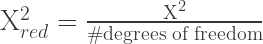
where
degrees of freedom = # points – # parameters.


Linear interpolations/regressions also produce a “q” coefficient. As far as I can tell, q always equals one, regardless of what type of data I use. I thought perhaps q = the regression coefficient (r), but a completely random dataset (r=0) still generated q=1. So I don’t know what q is. So there. 😛
This concludes our discussion of plotting data and curve fitting with Grapher. Tune in next time when I plan to discuss contour and vector plots.


How do you remove the lines that connect them together? I just want the data points, is that possible?
I second this question.
I am interested in this as well. In 3D it seems like grapher can only display the points if theres a line connecting them
Hey love these posts they are really helpful…
One question though, when I am trying to do the ‘custom fit’, I can’t seem to add any parameters!
Where exactly is the add parameters button ?
Could you maybe post a screenshot ?
cheers
I can’t get this to graph 3D data i.e. 3 columns of data) despite it being inputed/imported. Any thoughts?
Thanks!
@Sammie: click on a data point on your line, click “info” in top right corner, unclick the line feature and change the appearance of points etc.
q can be a degree of freedom (for n parameters n-1, so 2-1 =1), Chi2 distribution always has one, as it is a sum of squared normally distributed variables.
I can’t find the little “+” to add more parameters for custom fitting a curve? Where is it gone?
Thank you for this page — I have struggled with Grapher, its countless bugs, and its virtually nonexistent “Help” files for years. I never did understand how to deal with point sets. And am still confused by the third column in the Edit Points menu! And I would STILL love to be able to JUST SEE POINTS so that I can get a 2D and a 3D scatter plot. But have no idea how to avoid the colossally stupid lines that Grapher is determined to connect consecutive points with.
Grapher is potentially a wonderful program, but in actual fact it is so buggy and unable to do so many basic things that the appropriate words for it are unprintable.
You can’t even plot points, as any statistician would want to do! (Points, not lines.)
To remove the lines:
1) select your point set 2) click on the “Inspector” button (top right of graph) 3) deselect the “line” checkbox 4) change the fill color from white to your favorite 5) Enjoy!
Also within “Inspector” dialog you can change the mark shape from circle (default) to squares, diamonds or crosses.